Hey Trainers! Be sure to check out Corsola Beach, our newest section on the forums, in partnership with our friends at Corsola Cove! At the Beach, you can discuss the competitive side of the games, post your favorite Pokemon memes, and connect with other Pokemon creators!
Due to the recent changes with Twitter's API, it is no longer possible for Bulbagarden forum users to login via their Twitter account.
If you signed up to Bulbagarden via Twitter and do not have another way to login, please contact us here with your Twitter username so that we can get you sorted.
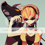
I love your vibrant colors! My favorites would have to be the Gliscor, Elesa, Suicune, and Ke$ha. As for any crit... The subtext on the DPPt legend icons isn't necessary. Icons shouldn't have too many words on them, even if applied in a small font size. The icon of the girl with the red hair is a little... unnatural because her hair is too red-purple. You should go for a warm palette when your subject is a young girl. So UMMM. Keep it up! You're amazing. :3
This is a very nice round-up of graphics! You have a good, steady style; it's always good when you can tell the same person did all the graphics, because it means you have a recognizable style.
The colors are nicely saturated and the effects are very good! My fave has to be Elesa - she looks dashing.
The text looks a bit broken-up. Those icons of the legends are amazing and well-rounded, they have a good palette and are pleasant to see, I would just take away the text :3
This is a very nice round-up of graphics! You have a good, steady style; it's always good when you can tell the same person did all the graphics, because it means you have a recognizable style.
The colors are nicely saturated and the effects are very good! My fave has to be Elesa - she looks dashing.
However I am going to agree with this:
The text looks a bit broken-up. Those icons of the legends are amazing and well-rounded, they have a good palette and are pleasant to see, I would just take away the text :3
Thank you, Aori! And yeah, I really liked the Elesa stock. In hindsight, I probably wouldn't have used the subtext, but I've seen others pull it off so well, I decided to give it a try.
Thank you, Aori! And yeah, I really liked the Elesa stock. In hindsight, I probably wouldn't have used the subtext, but I've seen others pull it off so well, I decided to give it a try.
I totally get you! When I used to make a lot of icons, I also tried the subtext thingy and I never got it right! xD what I found that looks cute somethings is small text, like, impossible to read text, above a bigger text.
But, random comment aside, I repeat - awesome graphics! :3 you should post more! I can't wait to see!
This site uses cookies to help personalise content, tailor your experience and to keep you logged in if you register.
By continuing to use this site, you are consenting to our use of cookies.


 My fave has to be Elesa - she looks dashing.