• Hey Trainers! Be sure to check out Corsola Beach, our newest section on the forums, in partnership with our friends at Corsola Cove! At the Beach, you can discuss the competitive side of the games, post your favorite Pokemon memes, and connect with other Pokemon creators!
  • Due to the recent changes with Twitter's API, it is no longer possible for Bulbagarden forum users to login via their Twitter account. If you signed up to Bulbagarden via Twitter and do not have another way to login, please contact us here with your Twitter username so that we can get you sorted.

News Pokémon: The Origin!

Status
Not open for further replies.
I'm kind of curious as to why they're making this now. It's not the 15th or 20th anniversary of Red/Green being released in Japan or anything like that (it's not even any anniversary actually). I guess it's kind of close to the tenth anniversary of FireRed/LeafGreen but it's still a few months off. Was there some huge demand for this? Maybe there's some sort of tie-in to the Kanto story in X/Y that hasn't been revealed yet, or maybe they're planning on releasing the first generation games on the 3DS virtual console soon, but who knows? I'm not saying they shouldn't have made it, but it's kind of odd that it's coming out now.
 
I don't think the producers of the current anime would ever allow a new series at all (handled by different people, of course) unless they had an ending set and soon...
Pretty sure there is something about it on whatever deal they have with TPC.
 
The characters look pretty good, actually. They don't look generic like most characters from modern anime and they also have that wonderful 90s charm.

The animation style looks so much like the early-Digimon movies. I like it.

Also this ^
 
I noticed that Red's pose on the site is Paul's though basically.

130817_g01_pic16.jpg

VZf3Wew.png


I honestly am shocked people who like Red are happy with how he looks here, I think he looks embarrassing.
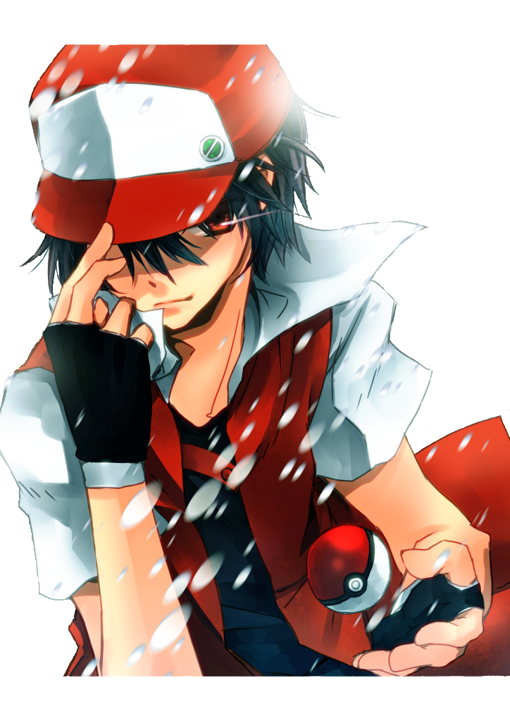
 
Because they don't look appealing at all and look too blob-like.

Red and Oak are the worst offenders to me.

It's just as "blobby" as the main anime's animation. It's just a different art style. Although I prefer the original anime's style back in the 90s above all else (especially the movies). Much better shading.

I do think Red's design looks pretty awkward compared to his game version and his other counterparts. It might take time to get used to it.
 
I thought the characters looked like Digimon Adventures characters. (I don't consider this a good thing)

Anyway, that pose is a common reference pose. Nothing special about it.
 
I just feel like Ash has more impact than the design of Red here, he's not visually appealing nor eye catching in any way. Even the new Sugimori Red looks more interesting.

I like the Pokemon and how they look, but they really flubbed it with the characters. Kind of wish they went for the classic look since it was the ORIGIN, and not the newer designs.
 
I honestly am shocked people who like Red are happy with how he looks here, I think he looks embarrassing.

I think Red looks great. Thank Arceus he doesn't look like this:

red_pokemon_render_by_k1113-d45rh6r.png

Now that would be embarrassing.
 
Half hour special with commercials.

Are you serious? A twenty minute special isn't nearly enough time to develop most of the characters, let alone do the Gen 1 games justice.

I do agree with you there. What's weird is that it says it's the premiere of an anime series on ANN:

Pokémon: The Origin TV Anime to Premiere in October - News - Anime News Network

Source: Dengeki

電撃 - 【速報】TVアニメ『ポケットモンスター THE ORIGIN』が、10月2日19:00から放送!――『ポケットモンスター赤・緑』を遊んだ人は必見

I'm all for this, either way. It'll be a nice throwback to Gen I. :)
 
I just feel like Ash has more impact than the design of Red here, he's not visually appealing nor eye catching in any way. Even the new Sugimori Red looks more interesting.

I like the Pokemon and how they look, but they really flubbed it with the characters. Kind of wish they went for the classic look since it was the ORIGIN, and not the newer designs.

Don't worry, I feel the same way. Though right now I'm just glad that didn't Pixiv-fy Red for the fangirls.

Hell, I'm glad they didn't Pixiv-fy Satoshi, although I would like him to actually look more mature than he was back in the Kanto saga (it's... the exact opposite).

Agreed. It's gonna take sometime for me to get used to Red's anime (or special, according to most) design. It's not perfect, but I think it definitely works for him.

As for Satoshi, totally agreed. What with his huge, brown, glistening eyes in BW. xD.
 
It's gonna take sometime for me to get used to Red's anime (or special, according to most) design. It's not perfect, but I think it definitely works for him.

This doesn't look anything like his Special design.

Also you're only have to get used to it for one special and then you can ignore it.
 
Status
Not open for further replies.
Back
Top Bottom